Arizona-Sonora
Desert Museum.
The museum's website buried the planning essentials (tickets, events, directions) under everything else. We redesigned the homepage to put them front and center.
Evidence. 88.89% of participants in usability testing couldn't find how to plan a visit.
My role. I designed the homepage redesign. Four-person team; the research was shared, the homepage was mine.
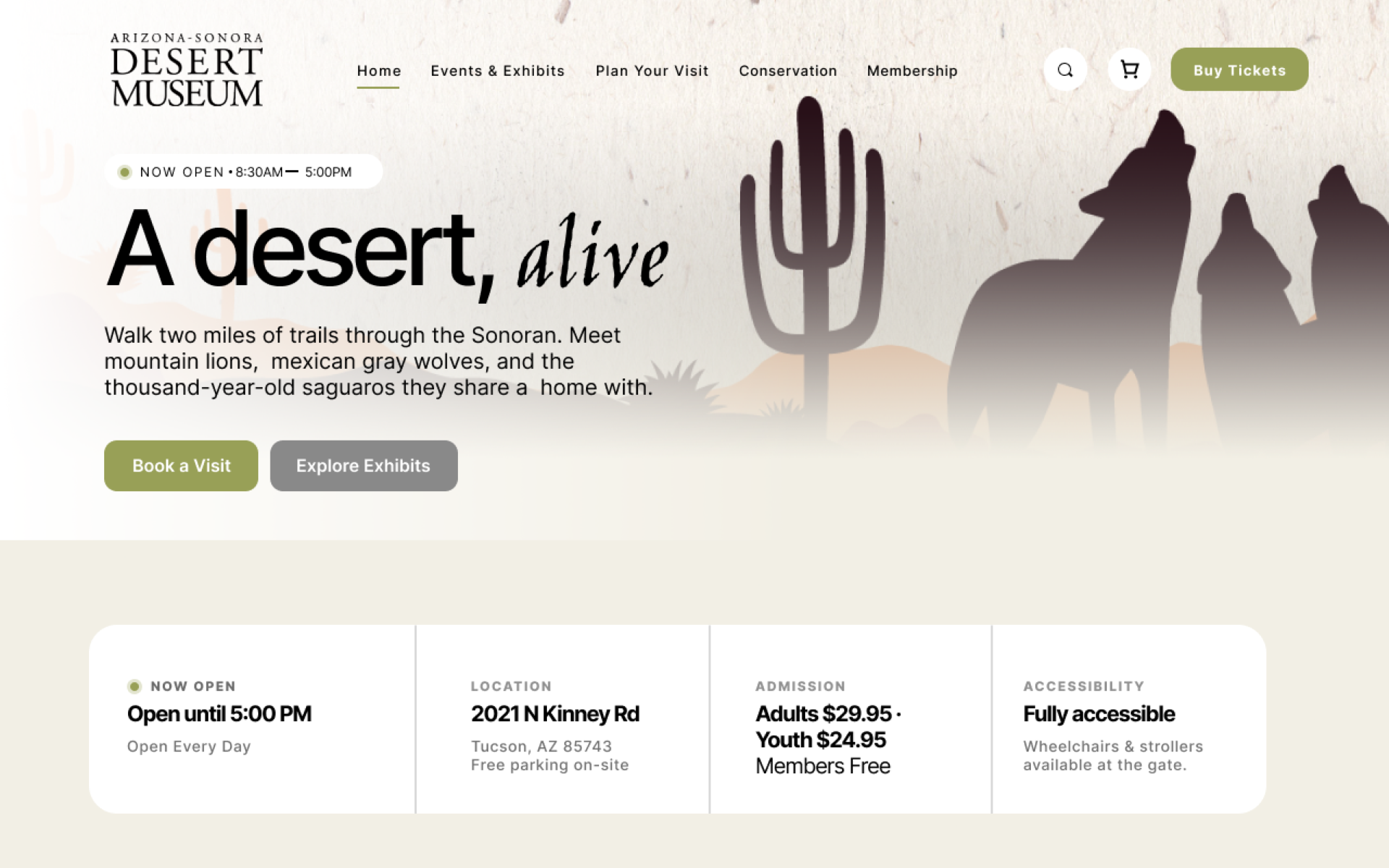
Outcome. A tagline hero, two clear CTAs, and a quick info row for hours, location, admission, and accessibility.
On the museum's website, most first-time visitors couldn't figure out how to plan a visit. That is the problem we set out to fix.
Make a real museum's website easier to use.
Our four-person team took on the Arizona-Sonora Desert Museum for a semester-long UX project: test the live site, find what was broken, and propose a redesign backed by research. Not a rebrand, the brand and content stay; we make them easier to use.
Each stage shaped the next.
We ran five research methods in order. What we learned in one fed into the next.
Heuristic evaluation
Four independent passes against Nielsen's 10 heuristics, scored 0 to 4 for severity. Flagged the high-friction zones before we asked any users.
User research survey
25 respondents from the target audience. Three sections: general behavior on museum sites, specific usability issues, demographics.
Persona creation
Three personas synthesized from survey patterns: The Planner, The Visual Explorer, The Self-Guided Visitor.
Usability testing
9 participants, remote via Zoom screen-share, moderated. 6 tasks across the three friction zones. Each researcher facilitated 3 sessions, one for each persona. Think-aloud, pre/post questionnaires, audio recorded.
Prototyping
Lo-fi wireframes for the homepage, events page, and ticketing flow → hi-fi prototypes in Figma → final recommendations doc.
Running them in order meant we knew where to test. By the time we ran usability sessions, the heuristic eval and survey had already pointed at the homepage, events page, and ticketing flow.
Seventeen issues, concentrated in visit planning.
The problems were in visit planning and finding information, not at checkout. Once users found what they wanted, they completed every purchase task. They could buy things; the trouble was finding them.
Task Performance (n = 9)
| Task | Success | Avg time |
|---|---|---|
| 1. Plan a Museum Visit | 9/9 · 90% | 104.2s |
| 2. Find pricing for a specific exhibit | 6/9 · 66.7% | 116.3s |
| 3. Find a specific event or activity | 5/9 · 55.6% | 144.2s |
| 4. Find a newly-added exhibit | 7/9 · 77.8% | 107.8s |
| 5. Purchase Event Tickets | 9/9 · 100% | 116.0s |
| 6. Purchase a Membership | 9/9 · 100% | 88.2s |
Task 3 was the lowest-success task in the study: only 5 of 9 participants succeeded, with the longest average completion time (144.2s).
Fig. 1. Usability test results across 9 participants and 6 tasks. The stat strip up top is the summary; the table shows where people failed. Takeaway: the trouble was at visit planning and finding information, not at checkout (every purchase task succeeded). People got slow when they couldn't find or sort the content.
·Top issues by frequency
The lowest-success task in the entire study was “Find a specific event or activity”: only 5 of 9 participants succeeded (55.6%), with an average completion time of 144.2 seconds. The site has the events. Users couldn't find them.
·What participants actually said
“I see the animals section but I don't know where exhibits are listed separately. It all blends together.”Participant JS-1, on Task 1 (Plan a Museum Visit)
“I don't see a calendar or events link anywhere in the main menu. I had to scroll all the way down to find some…”Participant JS-3, on Task 3 (Find a specific event or activity)
“Wait, quantity. How come it's not two? How can I edit it? Okay, I need to go back. Buy tickets.”Participant FA-1, on Task 5 (Purchase Event Tickets)
·The headline number
Aggregated across the 9 sessions, the post-test SUS-style rating averaged ~62/100, Nielsen's “marginally usable” band. Participants rated the overall experience 3.2/5; 4 of 9 said the website made planning a visit difficult; 5 of 9 wanted Events or Calendar promoted to a top-level nav item. Across the 9 participants, we logged 86 individual issue observations, which consolidated into 17 unique issues: 37 Major instances, 36 Minor, 10 Strong Suggestions, 3 Suggestions, 0 Blockers.
Takeaway. Users slowed down when they couldn't find or sort the content. The problem was the information architecture at the entry point, not checkout. All three of our recommendations target that entry point.
Three fixes, ranked by the data.
We picked the three issues that hit hardest: each one showed up for at least 88.89% of participants, or dropped a task below 60% success. We tied each fix to a UX principle from the Laws of UX(Fitts's, Hick's, Jakob's), so the reasoning would hold up if a stakeholder pushed back with “but I think…”
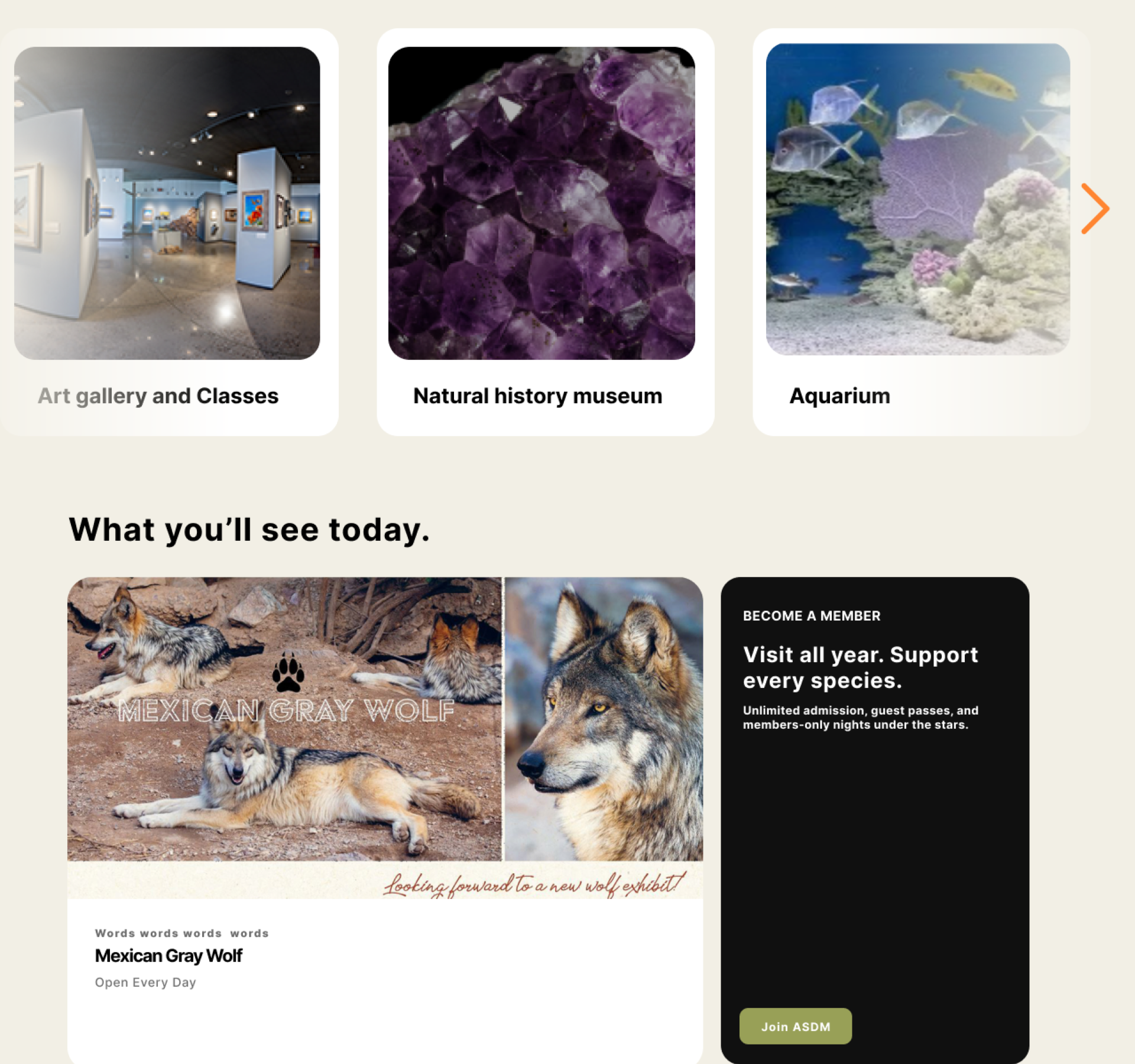
Streamlined Homepage
Fitts's Law · Hick's Law
Tagline hero with two clear CTAs (“Book a Visit” / “Explore Exhibits”) plus a quick info row (Hours, Location, Admission, Accessibility).
Compiled Events Page
Hick's Law · Jakob's Law
Dedicated “Things to See & Do” landing with prominent CTAs, leading to event-detail pages with scannable card grids.
Streamlined Ticketing Flow
Fitts's Law · Jakob's Law
Single bookings cart with quantity steppers for every ticket type. No more restarting the flow per type.
Three problems on one page.
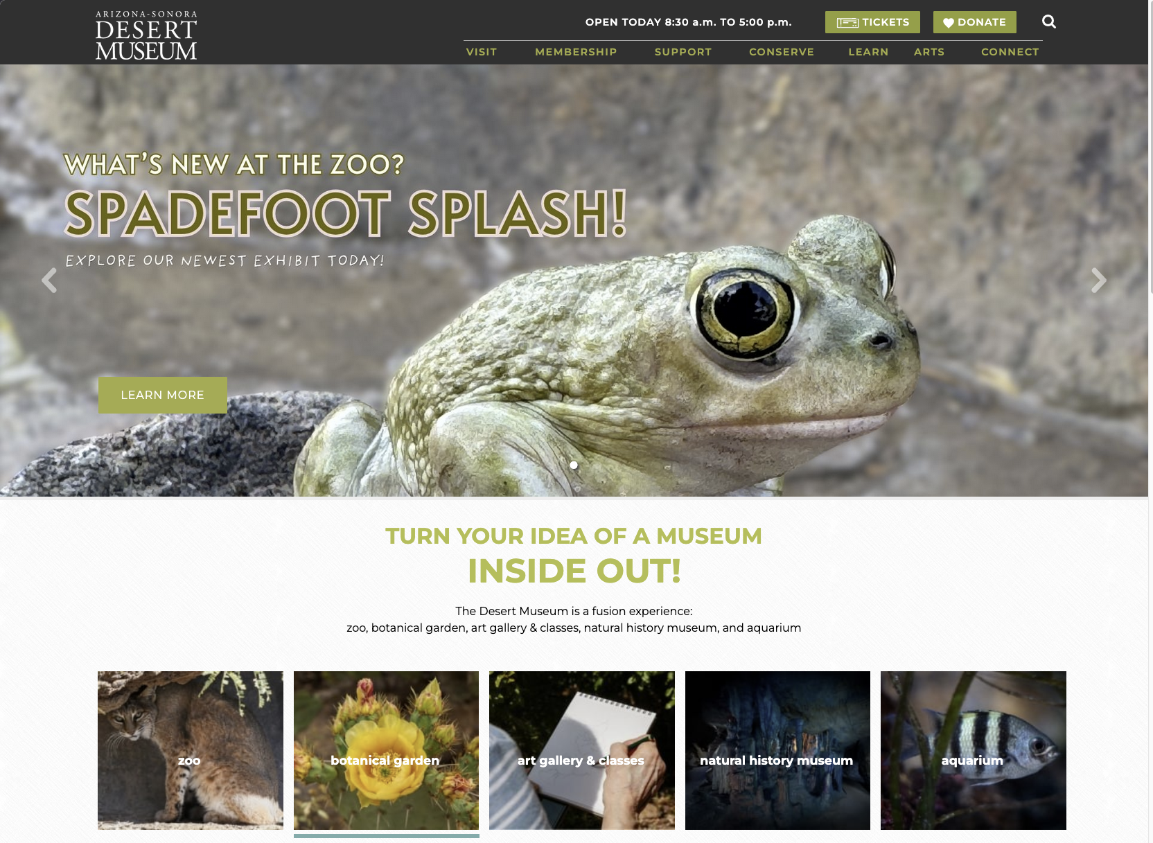
The current ASDM homepage fails at the most common task users come to do.88.89% of usability test participants couldn't locate detailed visit planning information.60% of survey respondents said they want a minimal, informative homepage. A Tickets button and today's hours sit in the header, but the rest of the planning content (directions, weekly hours, admission tiers, accessibility) lives two levels deep under the VISIT menu hover, while the hero promotes whatever exhibit is rotating.
·Sketching the homepage, before hi-fi
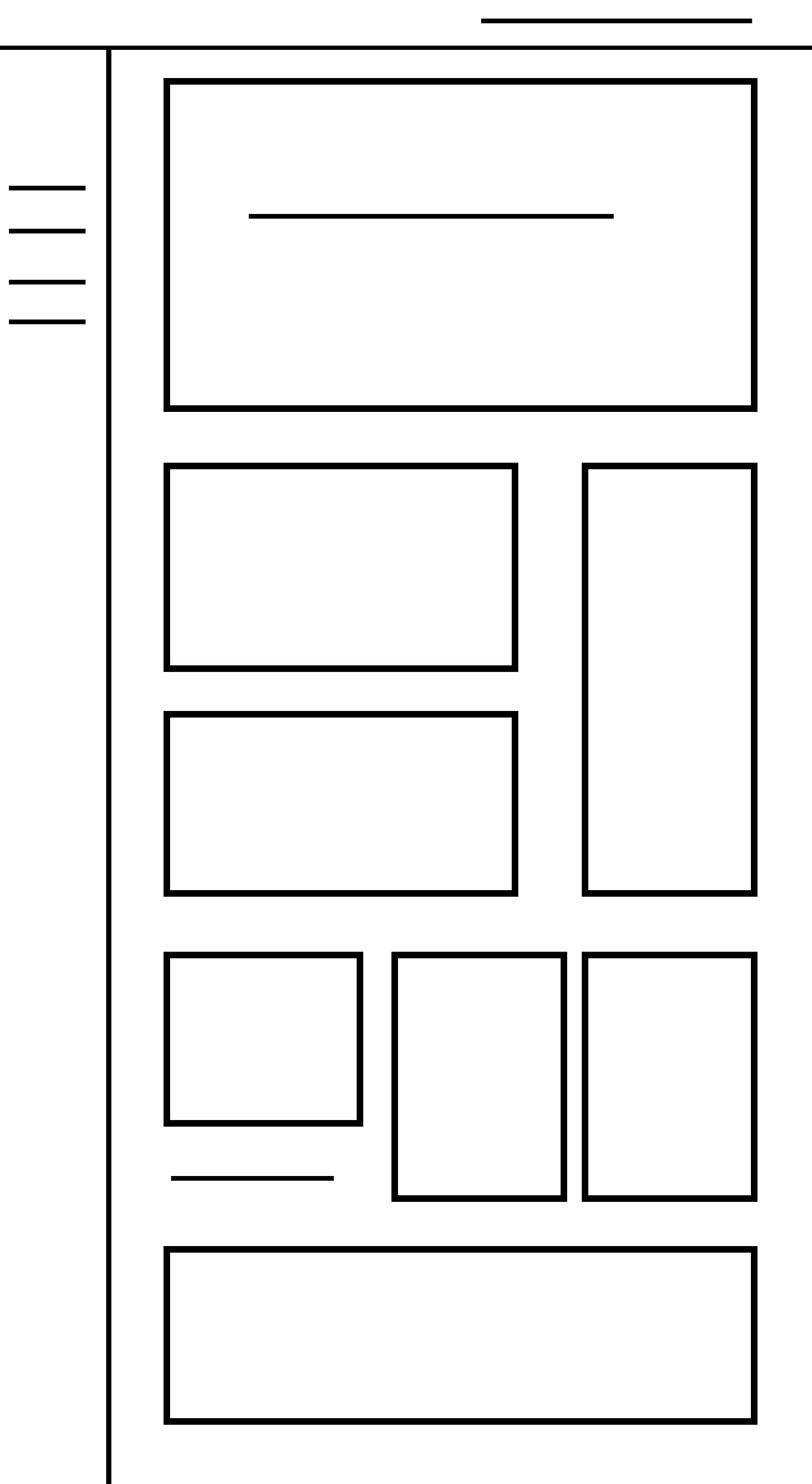
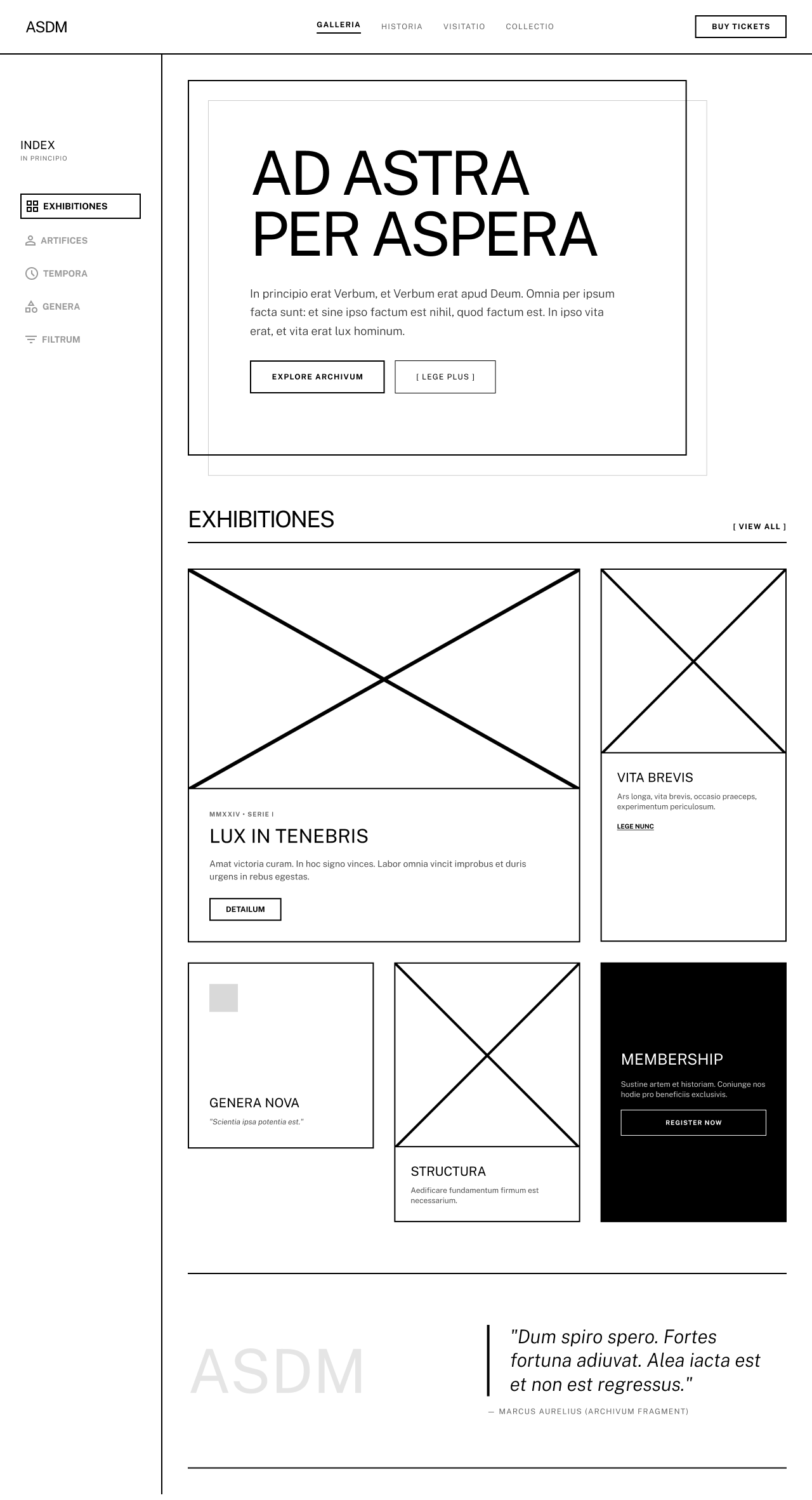
Before any hi-fi work, I sketched the homepage myself: first on paper, then in Figma as a lo-fi wireframe with Latin placeholder text. The point was to lock in the structural answer to the “88.89% can't find detailed planning info” problem before committing to visual direction. The rest of the team did parallel lo-fis for their pages; we combined drafts at the end of this phase before each of us took one page to hi-fi.
·Three decisions, made in order
Replace the rotating exhibit hero with a tagline + two CTAs
Why: Fitts's Law. Primary CTAs should be large, central, fast to acquire. The rotating hero forces users to wait through promotional content before they can act on the task they actually came to do.
Result: “A desert, alive.” tagline, with Book a Visit and Explore Exhibits as the two CTAs, both above the fold.
Add a quick info row below the hero
Why: Hick's Law. Every visitor lands with the same few questions: are you open, where are you, how much does it cost, is it accessible. Those answers should be right there, not something you have to search for.
Result: An Hours · Location · Admission · Accessibility row right under the hero, so the four most common questions are answered before anyone clicks.
Collapse the mega-menu to five top-level links
Why: The current navigation has 40+ items across 7 categories. Hick's Law again. The time to choose increases with the number of options. The 100% “page labels don't match mental models” finding meant simplifying labels mattered as much as reducing count.
Result: Home · Events & Exhibits · Plan Your Visit · Conservation · Membership, five primary links. Plus search, cart, and a Buy Tickets CTA on the right.
·Below the fold: cutting the carousel
The original homepage's “Happening Now” section is a five-card carousel of dense flyers. Most users scroll right past it. In our survey, 60% said they wanted a balance of visuals and short text, not dense walls of text.
Our team of four, and who did what.
All four of us built the survey together, created the three personas, ran three of the nine usability sessions each, analyzed the results together (coding and severity ratings), sketched the lo-fis, and wrote the final recommendations deck. Then each of us led one piece end to end:
Led the homepage redesign through hi-fi: tagline hero with Book a Visit and Explore Exhibits CTAs, quick info row, collapsed mega-menu to five top-level links.
Led the events page redesign: “Things to See & Do” landing, event-detail pages, filter and sort controls.
Led the ticketing flow redesign: single bookings cart, quantity steppers, integrated date-picker booking modal.
Led the synthesis of the team's findings into the final recommendations document, pulling research data, severity ratings, and design directions into the deliverable we presented.
Why this matters in a portfolio. Two of my other case studies are solo work. This one shows how I work on a team: dividing scope cleanly and being explicit about who owned what.
The research we couldn't fit in a semester.
A four-month UX research project ships the version of the work that fits in four months. Here's what we'd add if this were a real engagement, not a class:
- Eye-tracking on the redesigned homepage. Validate the hero-CTA hypothesis: do users actually look where we expect them to look?
- A/B test single-screen ticketing vs the current flow. Our usability test surfaced the friction; an A/B test would quantify the conversion lift.
- Mobile-first usability testing. Our sample skewed desktop. Most museum-trip planning happens on phones.
- WCAG 2.1 AA accessibility audit. Color contrast, alt text, keyboard navigation. Especially important for a museum that markets accessibility as a feature.
- Recruit Spanish-speaking and first-time visitor participants. ASDM is in the Sonoran borderlands. The current research sample didn't reflect that.
These are the next steps we'd take if this were a real project, not a class assignment.