WikiClaw.
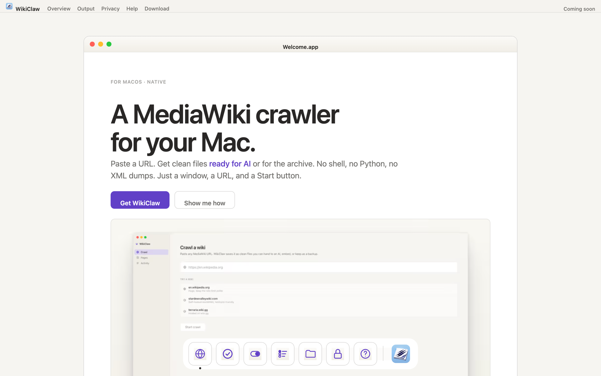
A MediaWiki crawler for the Mac, designed for two readers: the person using it, and the AI that reads the files it makes.
Solo project. I designed and specified everything below; AI translated my specs into the Swift build. This case study covers the design work.
WikiClaw has two users. One opens the app, clicks through a few screens, and hits Start. The other never sees the interface: it is an AI assistant that reads the files the app makes, to answer questions people ask it later. So I designed for both: the person using the app, and the AI reading what it produces. This case study is about that design work.
One product with two different audiences.
One audience is a person using the app. The other is an AI assistant that reads the files it makes and never sees the interface. I designed for both.
Opens the app and clicks four buttons.
Needs to know the URL is right, that the crawl is running, and where the files end up. This reader uses the UI, the status, the errors, and the output folder.
Never opens the app. Reads the files it makes.
Needs the information organized so it can find the right answer by meaning, not by clicking. It relies on how each piece is labeled, grouped, and given context.
Three interface decisions, and the constraint behind them.
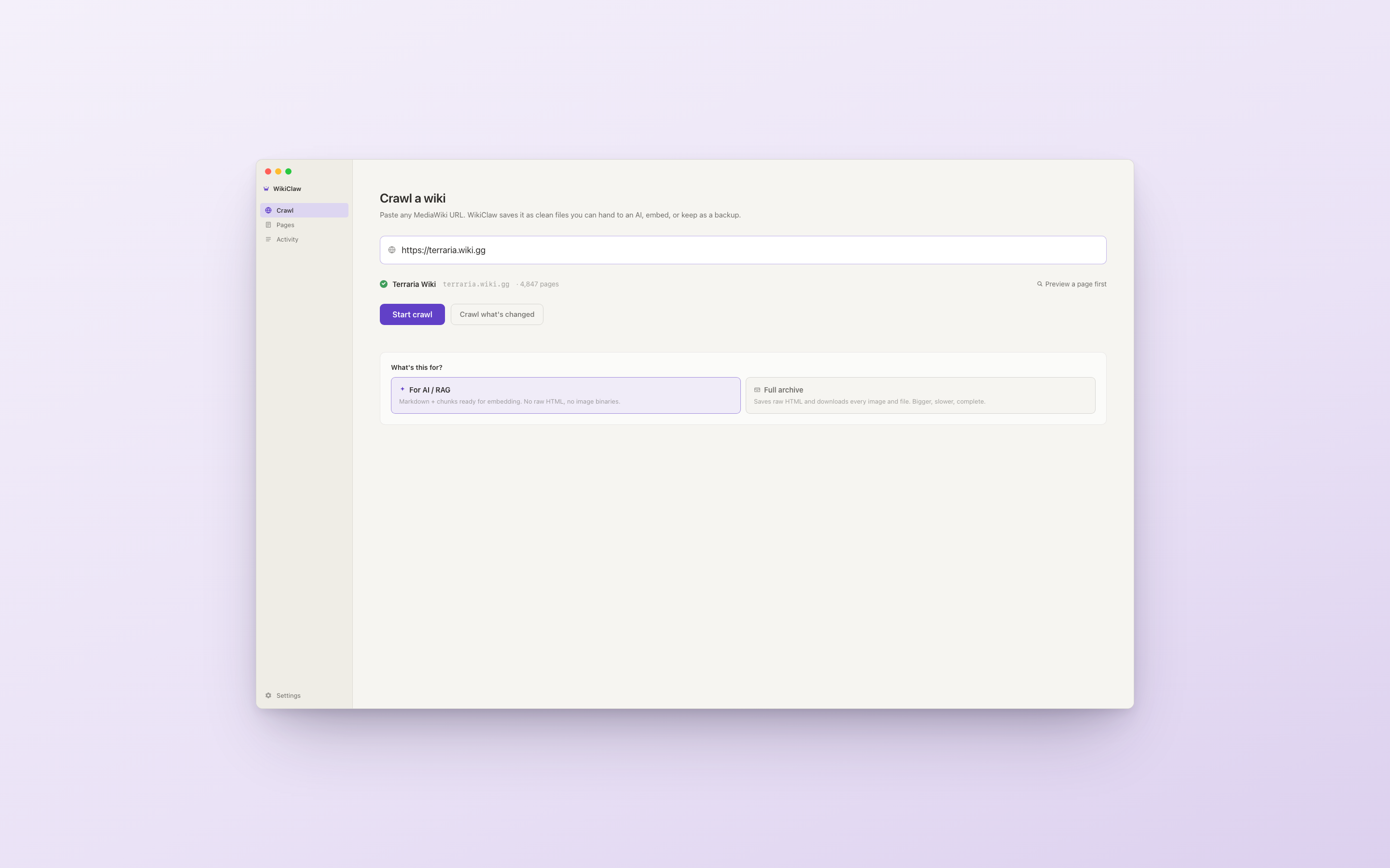
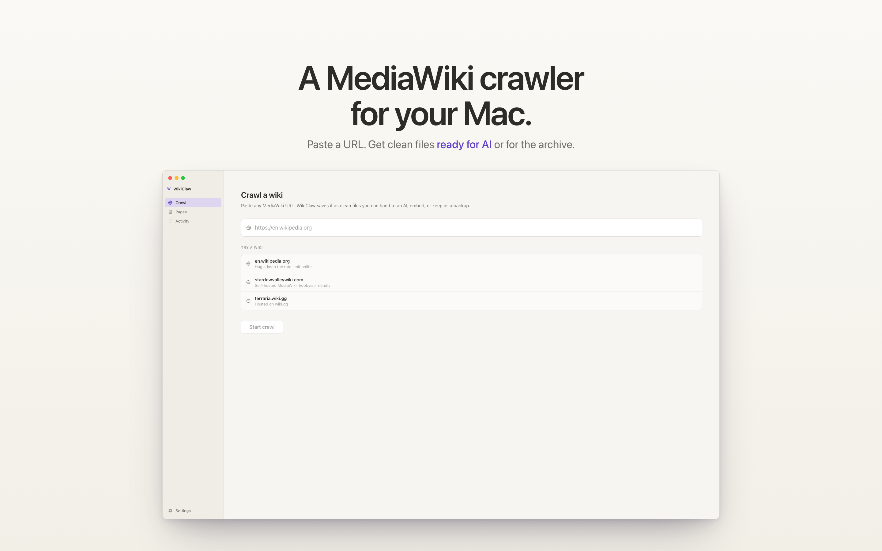
I kept the app simple. You paste a URL, verify it, pick a mode, and hit Start. Three controls. Most of the design work is in what the user does not have to think about: a verification step that catches a wrong link before a long crawl runs, and a single mode choice that replaced a page full of settings.
i.Verify before crawl
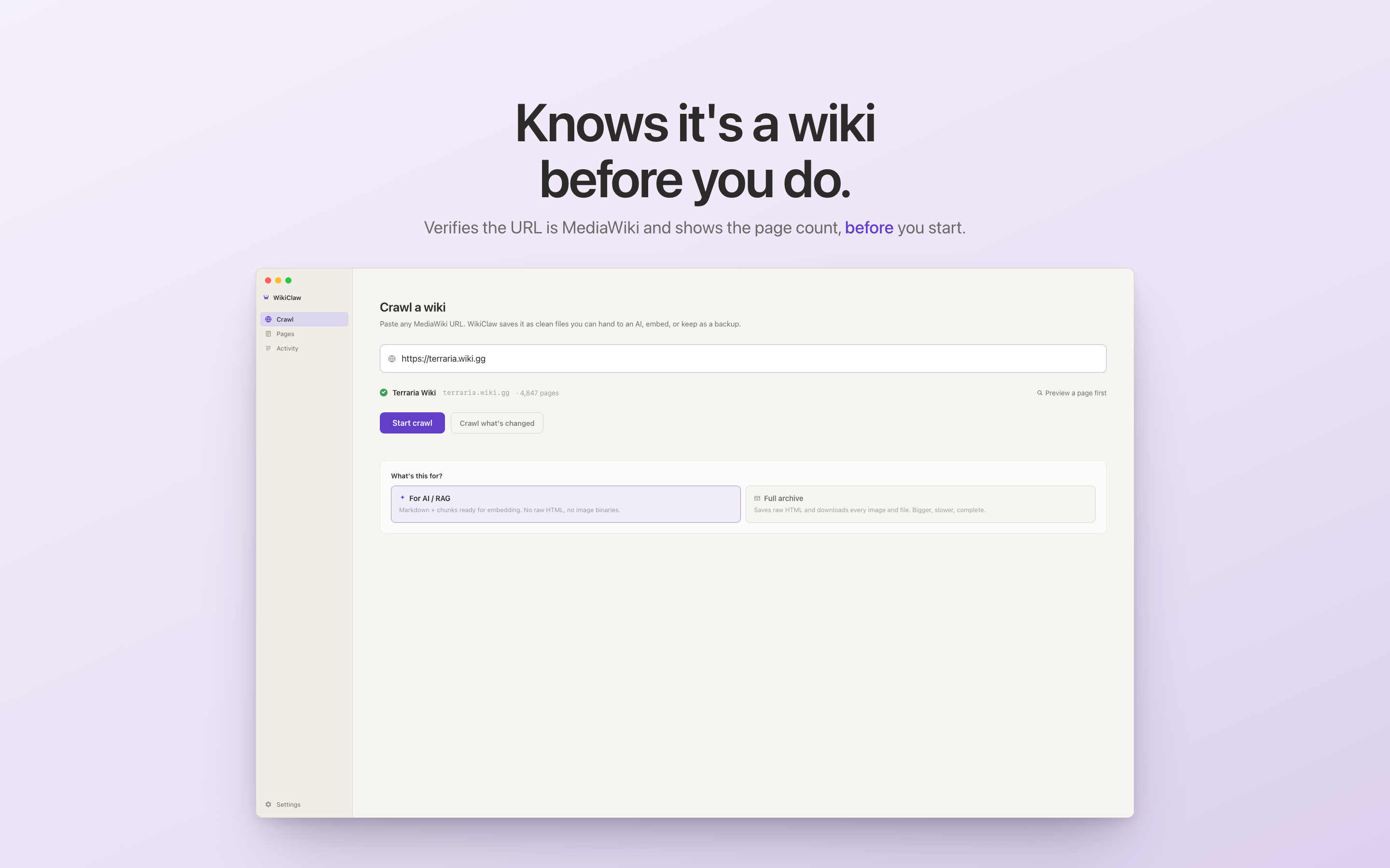
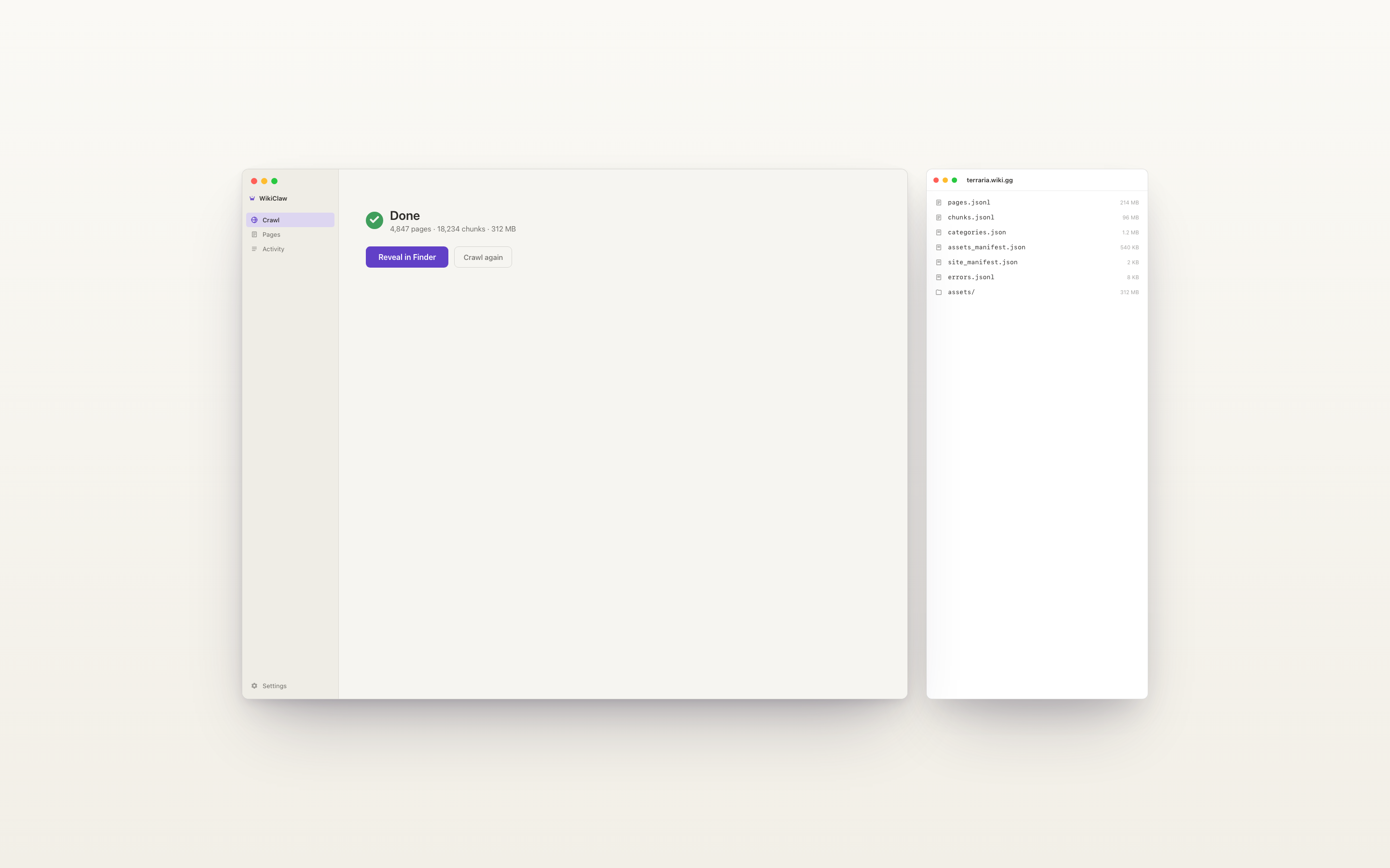
WikiClaw only works on MediaWiki sites, and many links labeled "wiki" are other platforms it cannot read. So before anything runs, it checks the link. If it is not a MediaWiki site, it says so right away, instead of starting a crawl that would fail partway through. If it is, it shows the wiki name and page count. The check takes about five seconds and prevents a failed crawl.
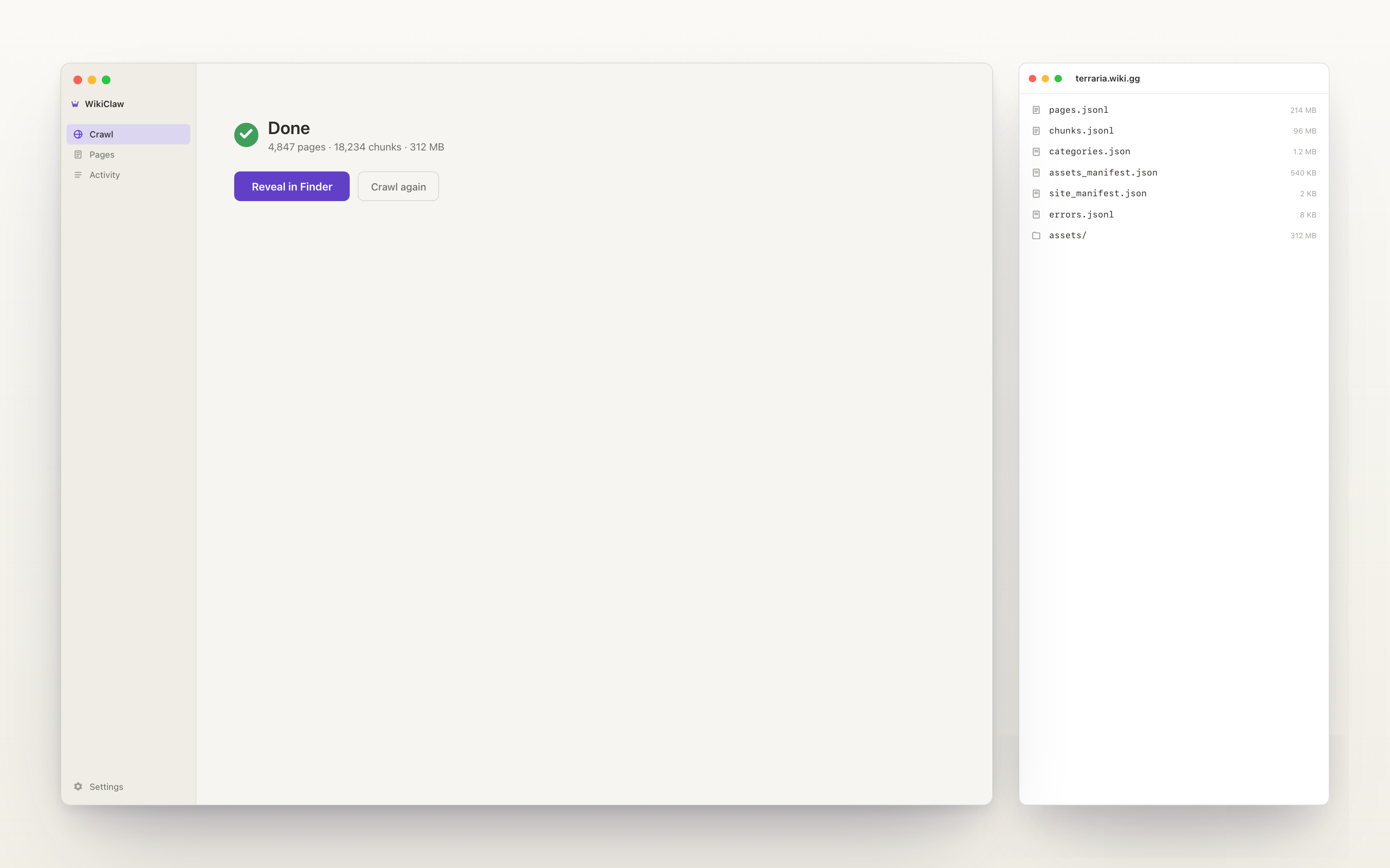
The result is the green check, wiki name, and page count below the URL field. Once you see 4,847 pages resolve, you can decide whether to crawl the whole site, and the "Preview a page first" link is there if you do not.
ii.Two modes, not a settings page
There are two main reasons to grab wiki data: feeding it to an AI, or building an archive. They need different output. Feeding it to an AI needs clean, well-labeled text. Building an archive needs the raw pages, images, and history. The first version of WikiClaw put all of this on a settings page with seven toggles, and it tested badly. Users did not want to figure out what "include section anchors" did before starting a crawl.
v1.0 replaced that with one choice: "What's this for?" AI, or Full archive. The crawler is the same either way. Only the files it produces change. The seven toggles became two cards.
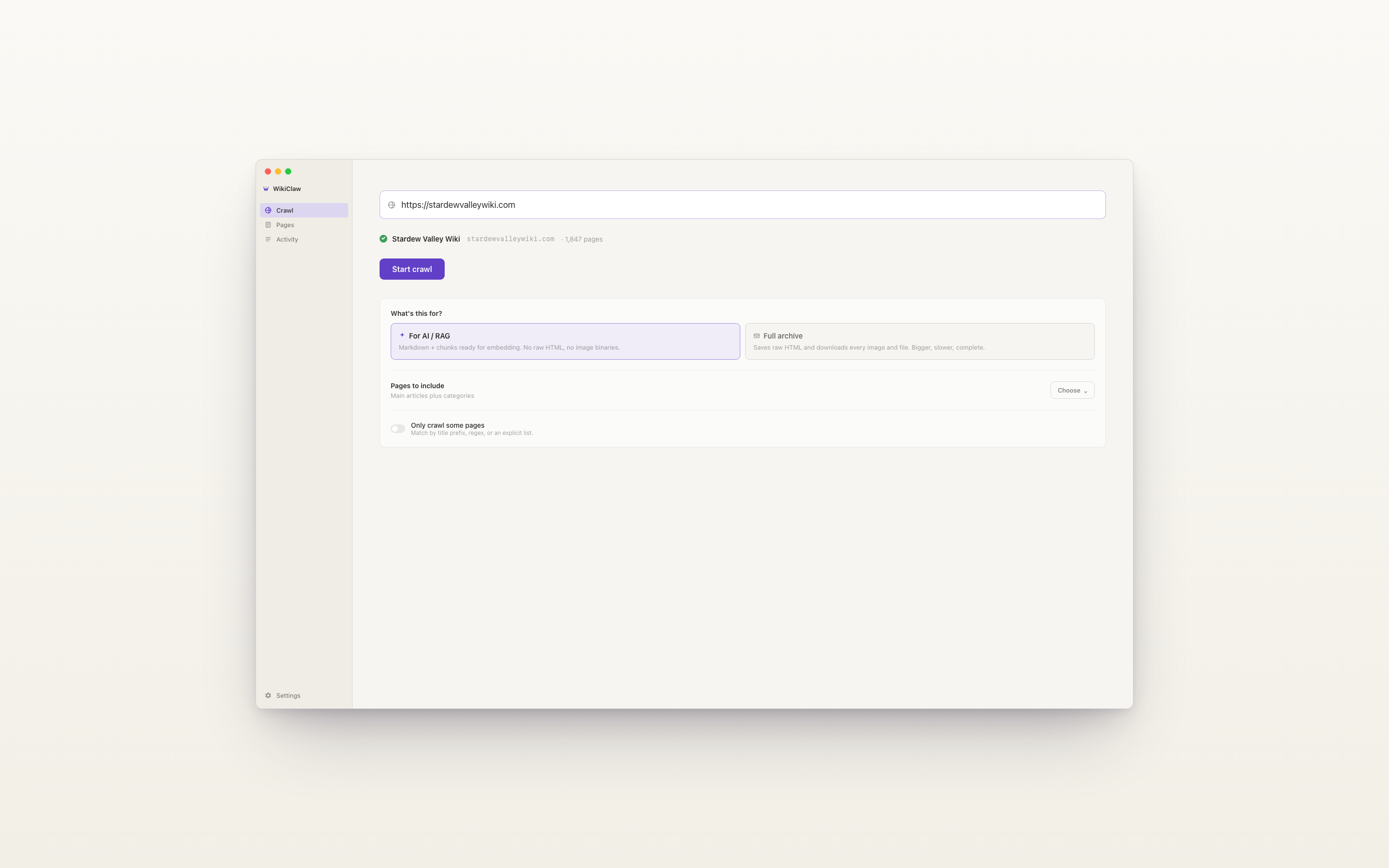
The detailed controls are still there. Click into Options and they appear: which pages to include, and ways to crawl only some of them. Most users never touch them, and whatever you do set is remembered, so your choices carry over to the next crawl instead of resetting each time.
iii.One technical constraint shaped the rest
A week before launch I had to choose how the app would pull pages from a wiki. That one choice set the limits for everything else: how big the app would be, how I could distribute it, and whether it could handle wikis with anti-scraper defenses. I picked Apple's built-in browser engine because it kept the app small and let me ship it to other people, not just run it myself. I compared two other options and documented the tradeoff, but the short version is that I optimized for being able to distribute a real, installable app. The result runs entirely on your Mac: no cloud, no account, no tracking.
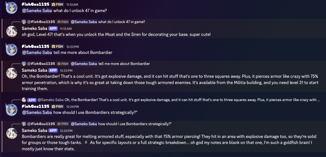
After v1.0 shipped, I tested the files with an AI assistant, and it couldn't find the answers.
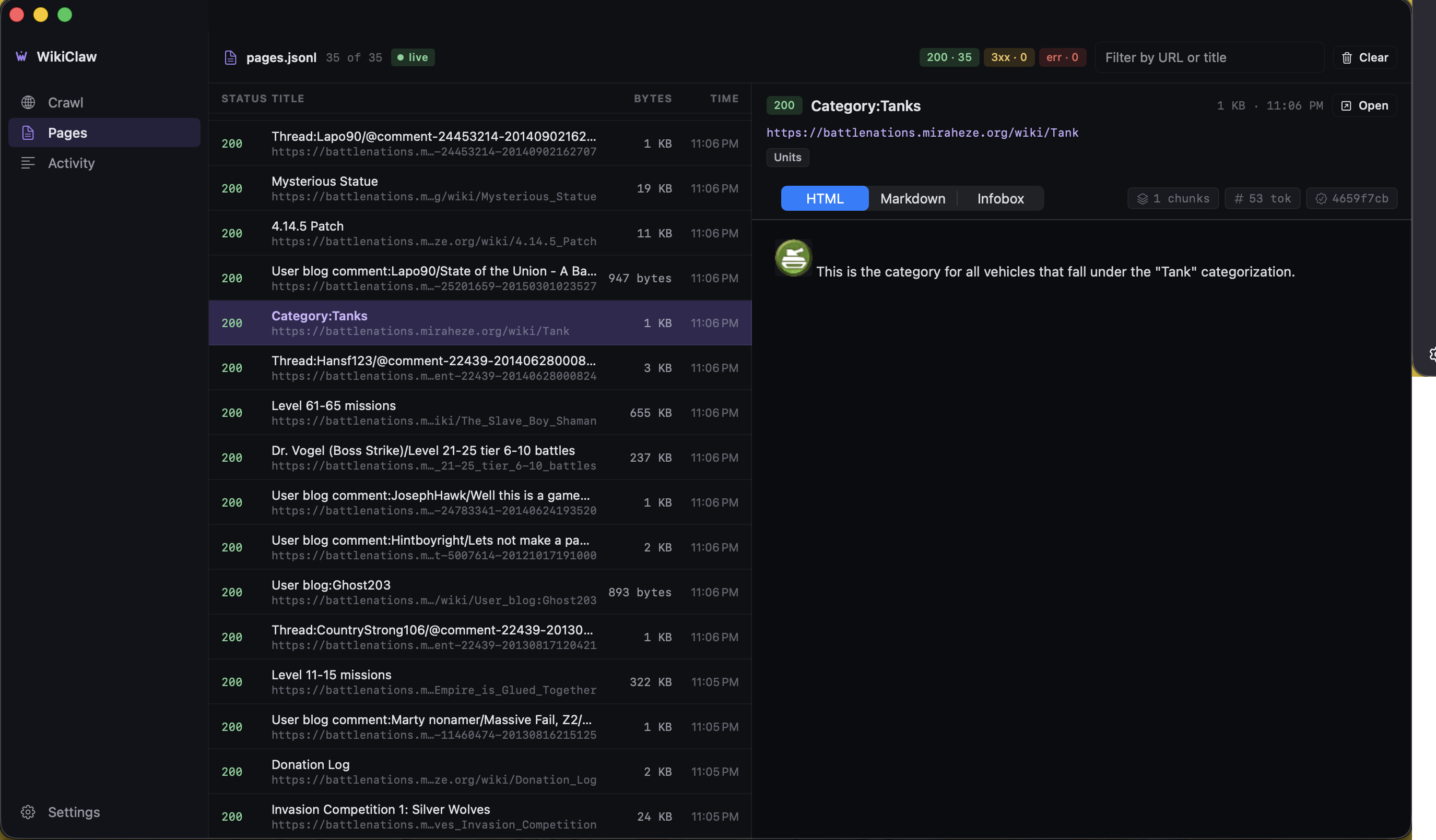
I shipped v1.0, then tested the files the way they are meant to be used: I loaded a wiki's files into an AI assistant and asked it questions. The answers came back wrong or empty. The problem was how the information was organized. The app saved each wiki the way a person reads it, page by page, section by section. But an AI does not browse; it searches across thousands of small pieces by meaning.
Organized that way, the pieces lost their context: thousands of sections were just labeled Strategy or Overview, indistinguishable from one another. The content was structured for a human, not for how an AI finds things. So I went back and redesigned the information architecture of the output. I found four problems and fixed them.
01.Each piece forgot where it came from.
Every piece of content was just a section body, like the text under a "Strategy" heading. The page name it came from was stored off to the side, where the AI's search never looked. So two "Strategy" sections from two different pages looked identical. The fix: add a short breadcrumb line to each piece, like Bombardier > Strategy > Level 5, so it carries its own context.
02.The stat tables never made it into the searchable content.
The fact boxes on each page (HP, cost, tier, range, damage) are exactly what people look up. But they were not part of what the AI could search, so a question like "what's the HP of a Bombardier?" returned nothing. The fix: turn each fact box into its own readable piece of content.
| Tier | 4 |
|---|---|
| Cost | 50 gold |
| HP | 120 |
| Range | 5 |
| Damage | 30 |
| Upgrade | 100 gold + 5 nanopods |
03.One size did not fit every AI tool.
Different AI tools want the content broken into different sizes. v1.0 used one fixed size that fit some tools and not others. The fix: offer a few size options so the output matches the tool.
04.Broad questions had nothing to match.
A question like "what's covered in this wiki?" needs a high-level pointer, not five detailed paragraphs about specific units. The fix: add a short summary for each page, with its title, intro, and a list of its sections.
·How I prioritized the four fixes
The four fixes were not equal. Two were high-impact and quick to build. The other two were worth doing but could wait.
~30 min · big improvement
~1 hr · main win for wikis heavy on stats
~1 hr · not critical
~1 hr · helps broad questions
Three questions that failed before now return the right answer.
The first real-world test was the Battle Nations wiki: about 1,200 pages, a mix of unit pages (heavy on stats), strategy guides (heavy on prose), and short trivia stubs. The crawl took six minutes at 1 req/sec.
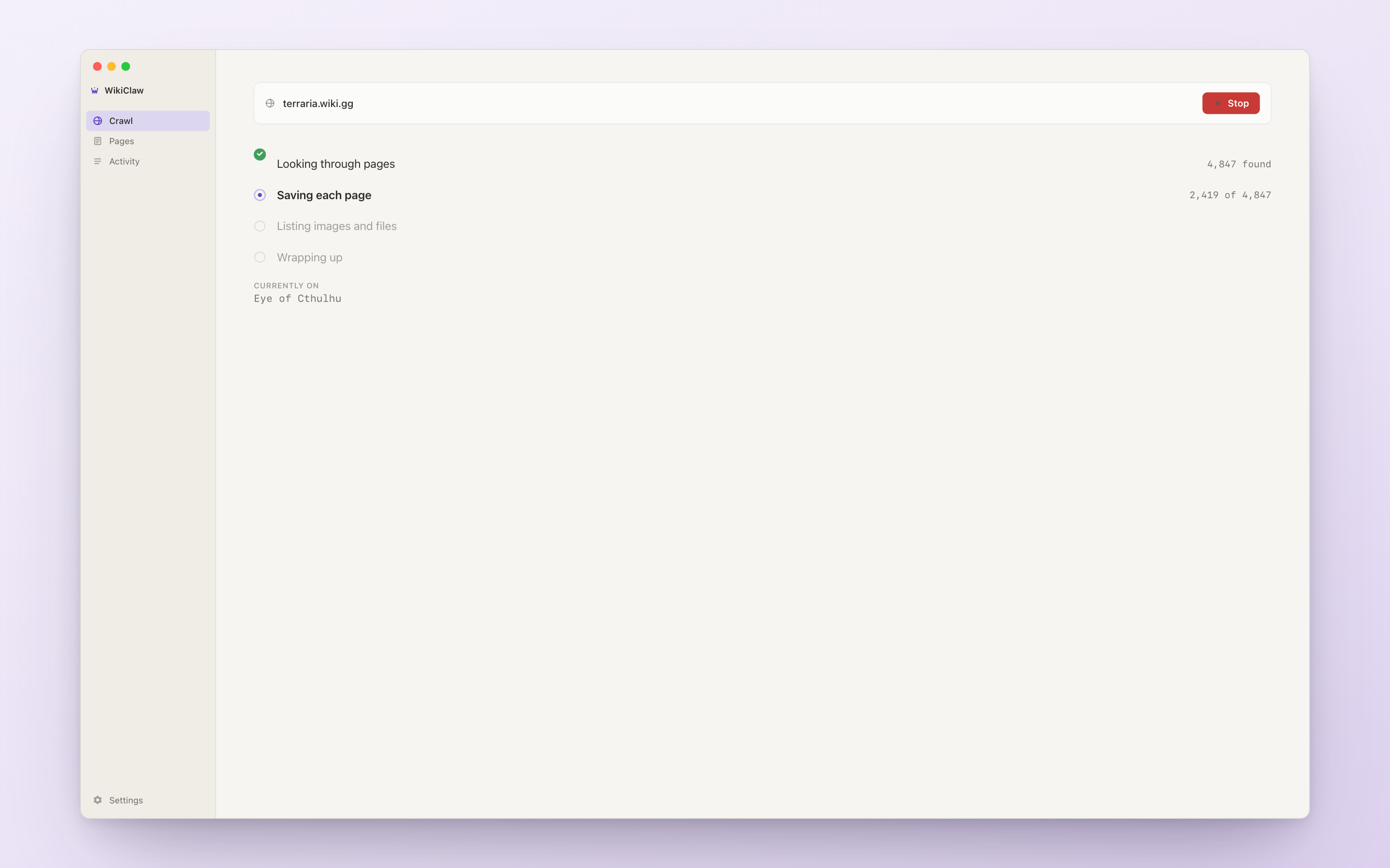
When the crawl finishes, the output folder opens automatically with the finished files inside, so the user never has to go looking for them.
I loaded the files into an AI assistant and asked three questions that had failed before:
- "What's the HP of a Bombardier at level 5?" → the fact box content answers it directly.
- "How should I deploy Heavy Tanks early game?" → the breadcrumbed Strategy piece answers it. Before, it was indistinguishable from the Strategy sections on other unit pages.
- "List the unit categories." → the page summary answers it, surfacing structure rather than prose.
None of these fixes changed anything for the human reader. They are not visible in the app. They only affect the files the AI reads.
Built in about a week, live on the App Store.
The whole product (Mac app, marketing site, the files it produces) was designed end-to-end in roughly a week, with AI translating my specs into a working build. v1.0 is now live on the Mac App Store, v1.0.1 is in design for the next submission, and the marketing site at wikiclaw.work is collecting waitlist signups.
The App Store screenshots double as marketing: the same cream and purple visual language as the app, with one headline per shot.
Shipping a Mac app meant designing more than the app. The app, the App Store listing, and the marketing site at wikiclaw.work use the same pitch and the same cream and purple look. Each reaches a different reader.
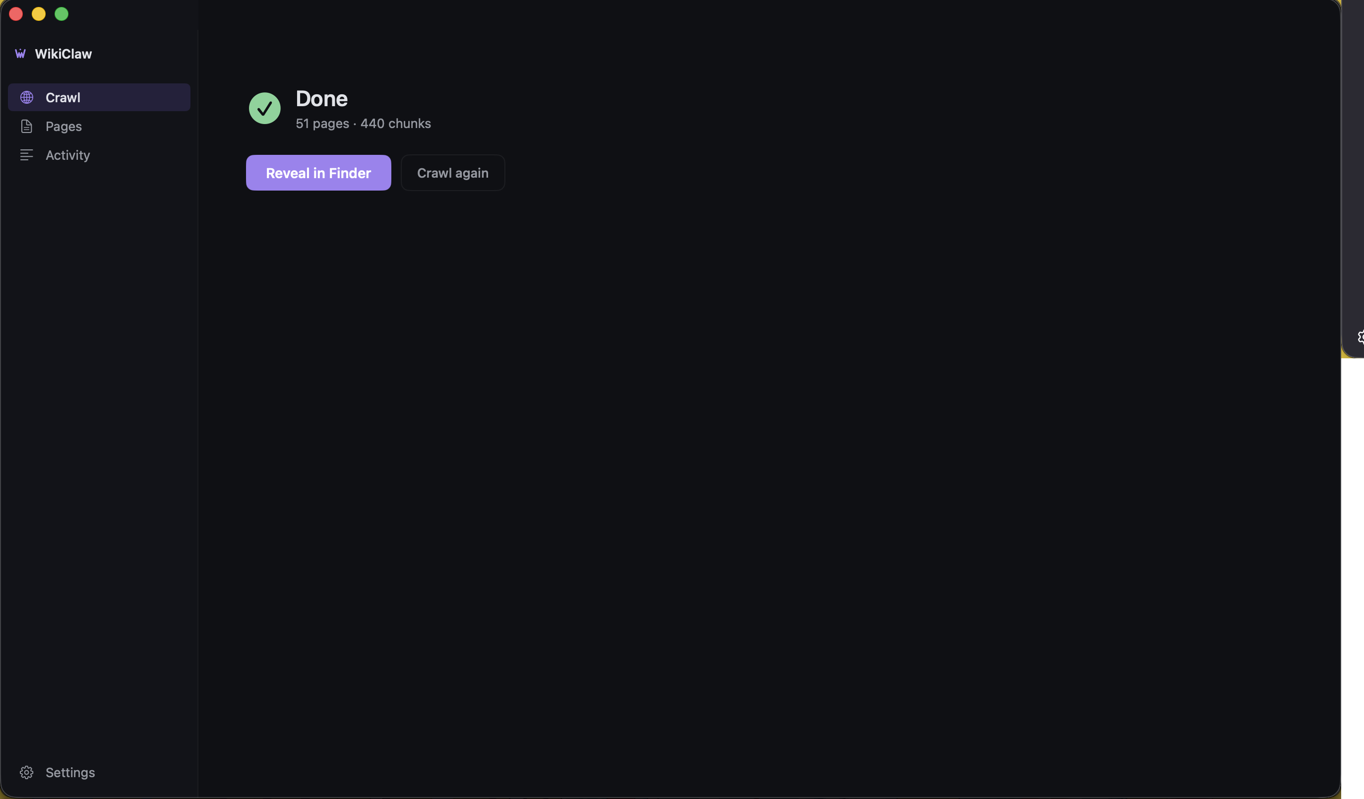
WikiClaw also ships in dark mode. The screens above are light; here is the same app in dark, including the page browser where you can inspect everything the crawl saved.
Designed end-to-end as a solo project.
WikiClaw is a solo project. I designed the product, the UX architecture, the information architecture for the AI reader (what goes in each piece of content and why), the App Store screens, and the tradeoffs documented above. For the Swift implementation, I used AI to write what I specified. With an engineer on the project, the design work above would have been the same.
- The product approach: designing for both the human user and the AI assistant that reads the output
- The UX architecture: verifying the link first, the two modes, and keeping the app eligible for the Mac App Store
- The output redesign: testing it with an AI and fixing the four problems
- The fetch-method tradeoff (covered briefly in §02)
- The visual design, App Store screenshots, and marketing site IA
- Every tradeoff documented above
- Translating my specs into compiling Swift / SwiftUI / WKWebView / SwiftData
- The Xcode project plumbing, entitlements, sandbox configuration
- The bug-fixing loops: reading stack traces, suggesting fixes
- The marketing site React / Next.js implementation
- The boilerplate code
Three things on the roadmap before v2.
Faster crawls. Running a few fetchers in parallel for roughly 2 to 3x the speed, with no change to how it is distributed.
Multi-wiki batch. WikiClaw currently crawls one wiki at a time. Researchers I've talked to want to batch-process a list of wikis overnight. Small UX change (a textarea where the URL field is), larger change underneath.
One-click output profiles. Presets like "Optimize for [tool]" that set the size and formatting in one move, so the user does not have to tune anything by hand.
The longer-term work is harder to put on a roadmap: treating the AI as an audience and designing the files with the same care as the UI. WikiClaw is the first product I've shipped where that was a main part of the work.
Four things I'd change.
Test the output before the UI. v1.0 was a week on the app with no testing of the files. The check that became §3 should have happened on day one. It would have caught the duplicate "Strategy" problem before it was built in. The output should have been tested before shipping, not at the end.
Talk to someone who had shipped a similar tool. I picked the browser engine based on my own constraints (App Store eligibility, distribution simplicity). It is the right choice, but it took three tries to get there. Twenty minutes with someone who had shipped a similar tool would have saved two of those iterations.
Design the verify step earlier. The verify step is one of the strongest UX decisions in the product, but it was the last thing I built. For a while, the crawl would fail about eighteen minutes into a wrong URL. If I had started with a sketch of the worst-case error path, the verify step would have been the second screen, not the last.
Use the output myself earlier. I caught these problems because I was feeding WikiClaw's files to a Discord bot my gaming guild uses. If I had wired that up in week one instead of week three, I would have caught them before the app was finished.